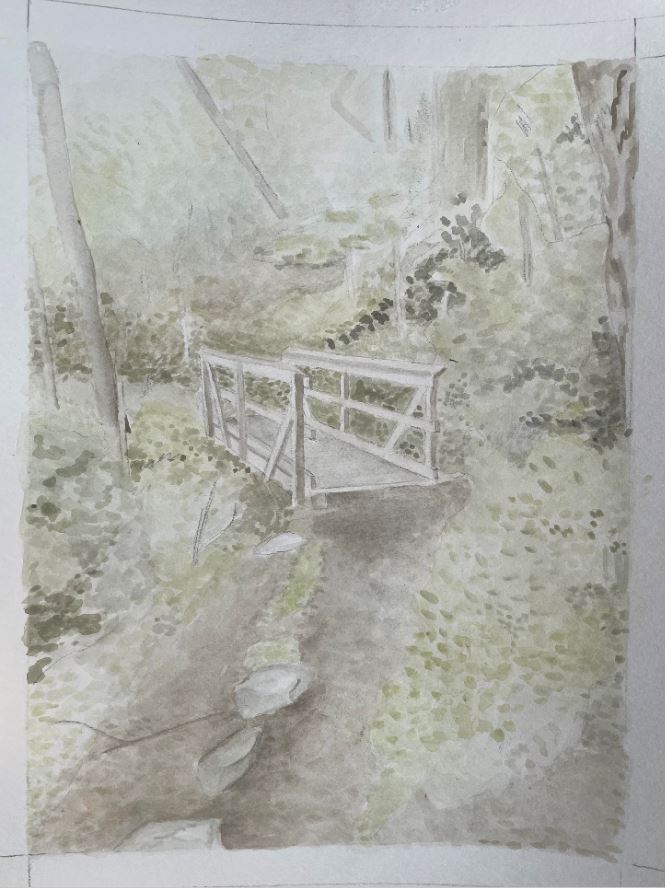
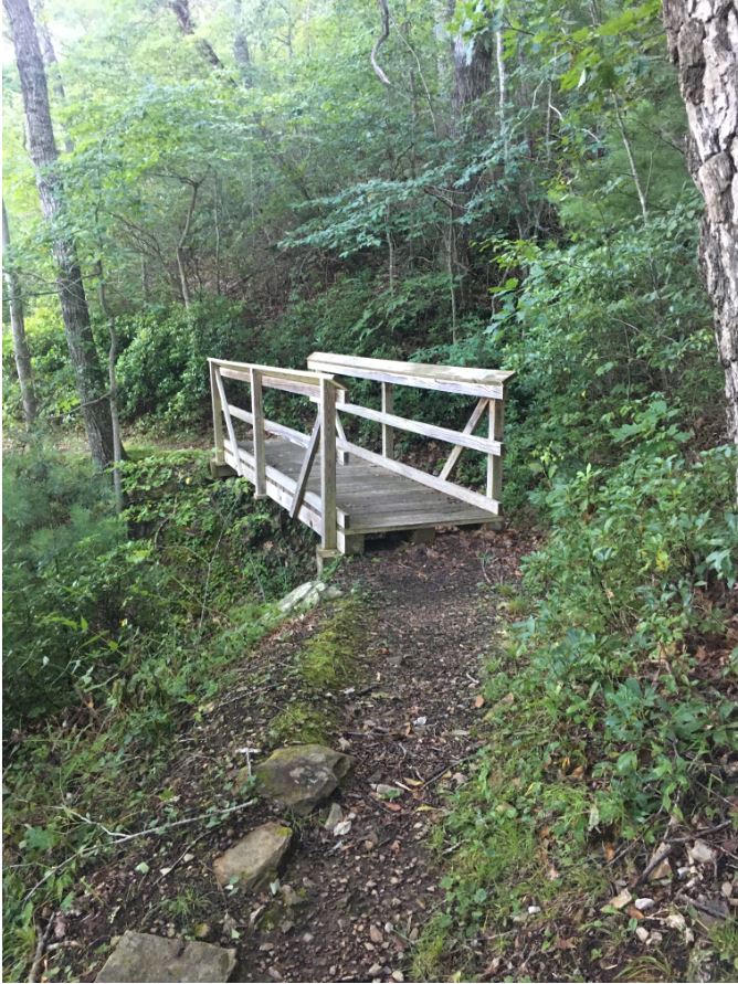
I like how accurately you placed the composition of your drawing in comparison to the photograph! I know that watercolor tends to lean towards a lighter color but I think you could still push the color intensity. You have such beautiful deep greens in your photograph and I would love to see that in your painting!
You could take a look at this artist’s landscape painting as an example of the deeper colors I am talking about.
2 Comments
I like how accurately you placed the composition of your drawing in comparison to the photograph! I know that watercolor tends to lean towards a lighter color but I think you could still push the color intensity. You have such beautiful deep greens in your photograph and I would love to see that in your painting!
You could take a look at this artist’s landscape painting as an example of the deeper colors I am talking about.
https://tonyconner.com/under-mountain-road-en-plein-air-watercolor-summer-landscape-painting/
I really like the way this turned out! The colors are so light and subtle