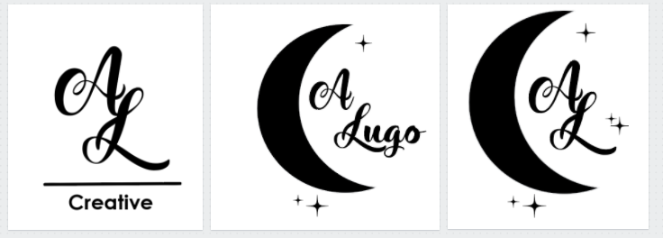
This is where I left my logo at two weeks ago. Since then I’ve been playing around with incorporating negative space, using different shapes, switching from crescents to a series of overlapping circles etc.
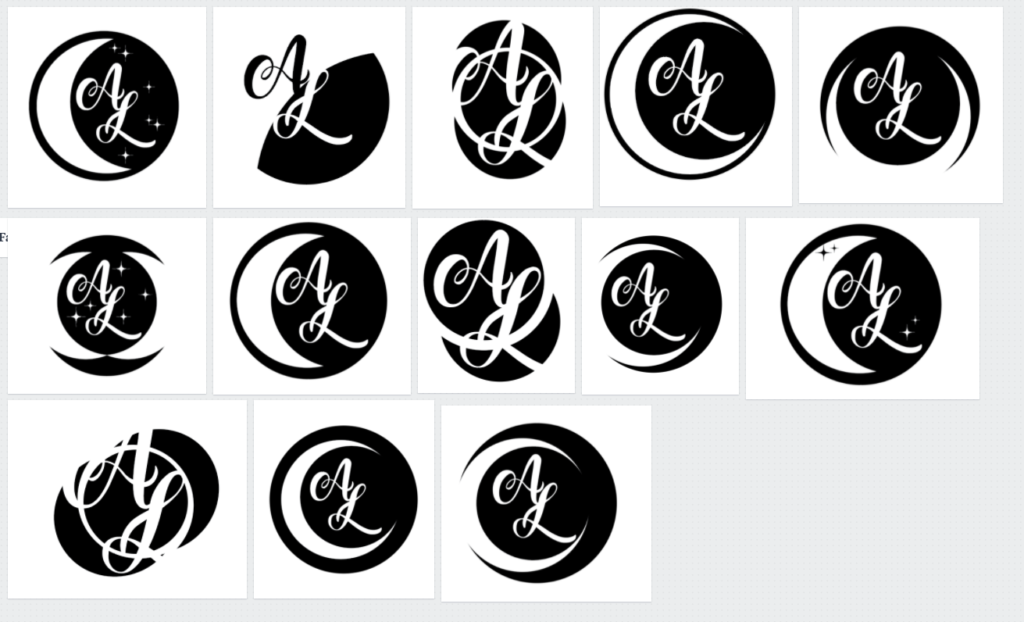
Which led me here where I sat for hours trying different things to improve the design. After being frustrated and feeling stuck I had to reach out for advice. I need a logo that is clean, simple, something that reflects my design work.


After speaking with my design professor and a classmate, I was able to finalize my logo design. The last image is the logo I’m going to use for my design work, and add to my website. I’m still going to use one of the 300 logos with the moon shapes when I create another website for my fine art.

3 Comments
oooo I love how clean this new one is ! very different than the moon idea
I love the dreaminess of the moon. I like the new one too, but I wish you were able to combine some elements from your original idea. Maybe with color you can excite the whimsical idea you first had. I can see purple or yellow looking nice.
Your new logo is spot on! So clean and modern-really nice changes.